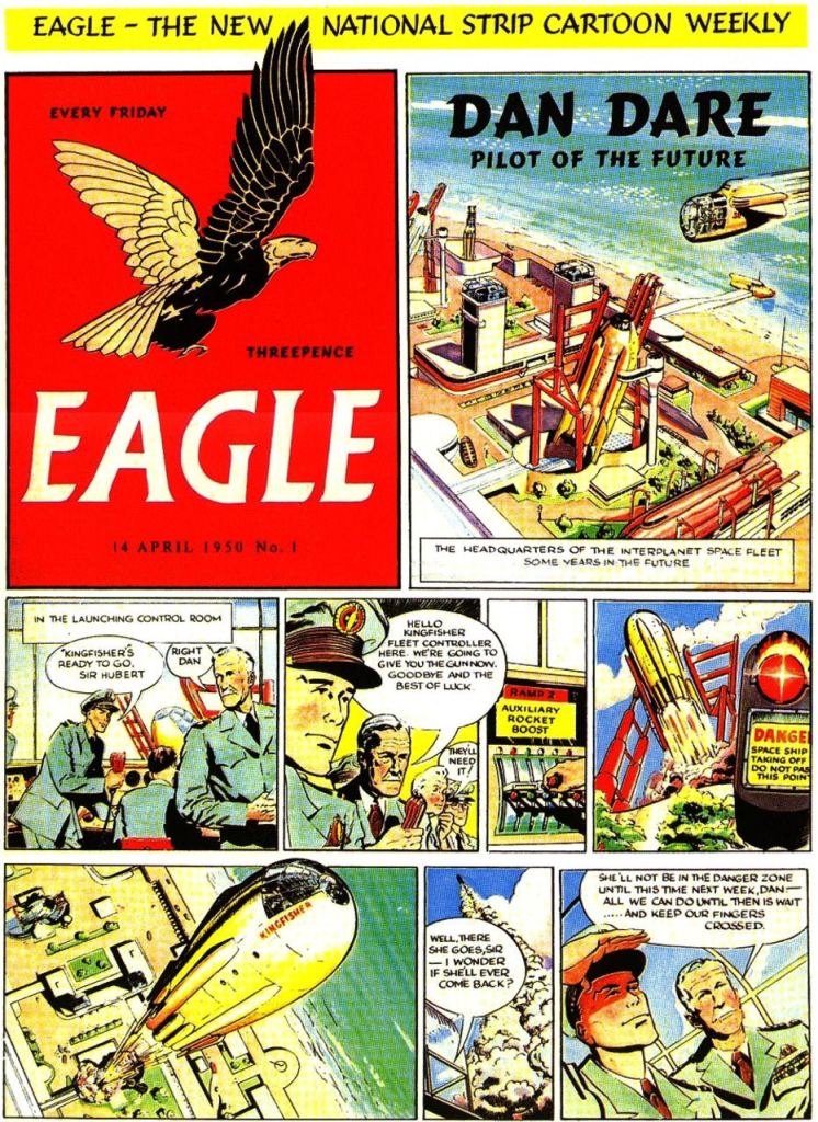
This month ComicScene 13 celebrates 70 years of Eagle and Dan Dare and we set you an art challenge to design a 21st Century version of the title or character. Judging was Lizzie Boyle, editor of Tammy and Jinty. Pat Mills creator of 2000AD, writer of Dan Dare and launching the new Space Warp this year. Steve MacManus, former editor of 2000AD. Finally Barrie Tomlinson, former editor of the 80’s Eagle.
Below are their thoughts on the designs. Thanks for their contribution and hopefully budding artists and comic creators will find their insights useful.
Here are some of the designs.


The Judges didn’t have names against the design, just numbers.
Here’s what they said.
LIZZIE BOYLE
What makes a great comic cover?
Design:
– Something that’s balanced and pleasing
– Something that catches your eye, whether from a distance on a busy shelf in a comic shop or as one among a checkerboard of small images on a screen
– For me, something that is simple and focused on core elements (but that’s personal taste)
Content:
– Something that hints at the story inside but doesn’t tell the story. It still needs an air of mystery.
– Something that suggests audience – but doesn’t exclude new audiences
The X Factor:
– Something that just makes you want to see what’s inside…
What makes Dan Dare / Eagle?
– For a re-launch, you need a mix of old and new – something that pays homage to the older comics but also brings in new elements.
– Similarly, some thought about the audience – are you chasing the “nostalgia pound” or have you brought in elements that will appeal to different readers? Does that make things clear or messy?
– Quality! Eagle had some high quality stories and artwork so it needs to look like it would belong in terms of quality of presentation
– Science – early Eagle had a strong focus on “possible science” as well as a love for spaceships and spacecraft, so it’d be great to see some technology!
Here goes:
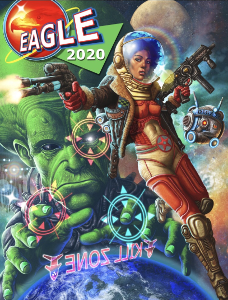
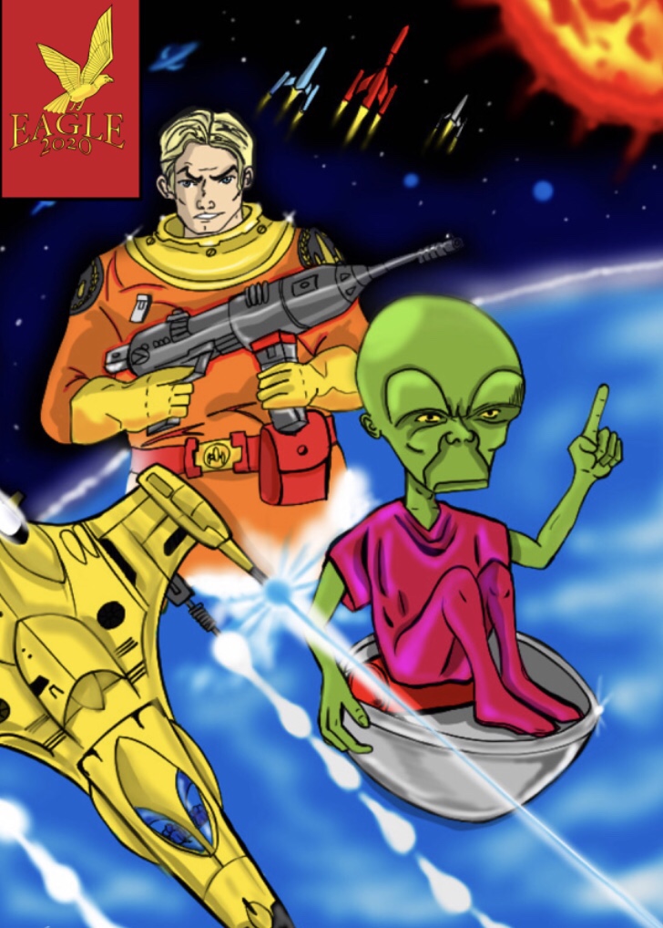
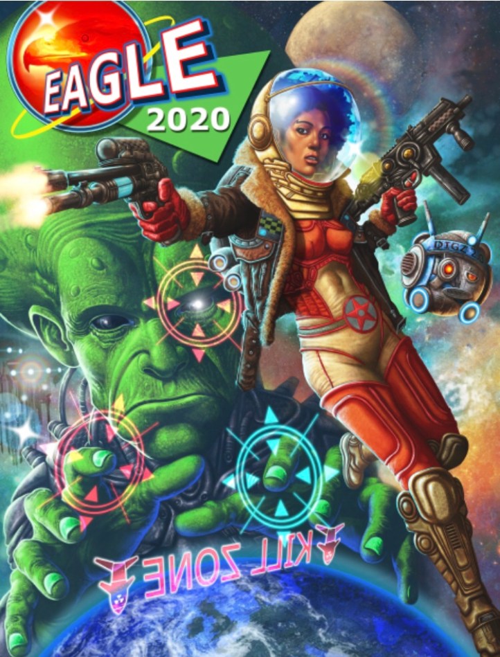
Charlie Gillespie – great balance of elements, our hero, our alien, our planet. Really nice diagonal flow from top left to bottom right. There’s action, there’s science, there’s looming menace suggested by the layout. And the artist has chosen a black female protagonist which could attract a wider audience. Possibly lacks space for any other cover text but overall I love it.
Mark Maguire – great movement and colour. Again a nice diagonal flow leading the viewer’s eye. I’d want to see more of the Eagle logo. It feels like it’s playing to the past – like a greatest hits of characters – and it’d be interesting to see how that might fit with the (hypothetical) content of the comic.
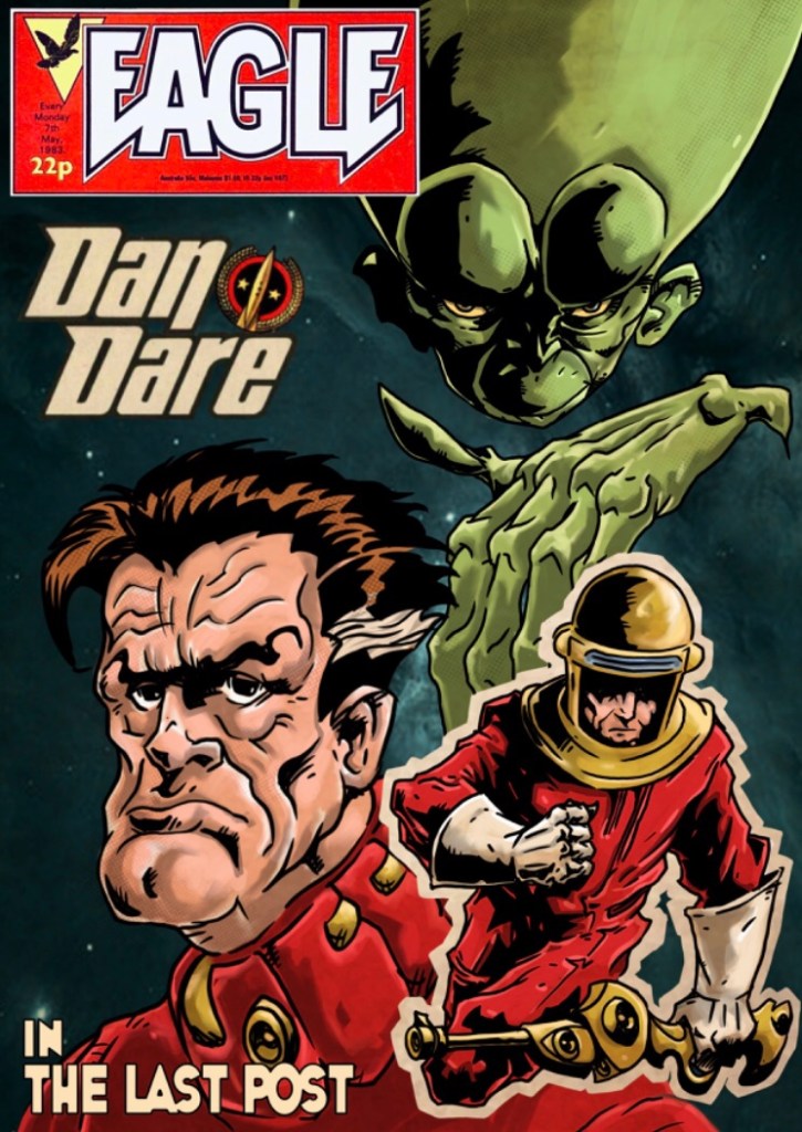
Christopher Geary – lovely image but it feels more like a sketch commission than a cover. If the masthead goes top right, then the top half of the comic becomes very crowded. It’s a great menacing expression though…
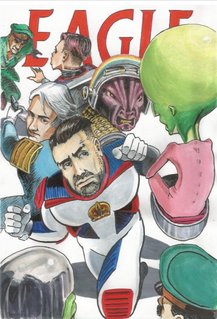
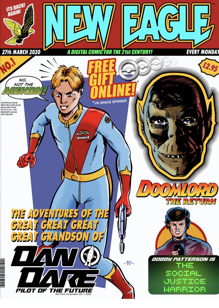
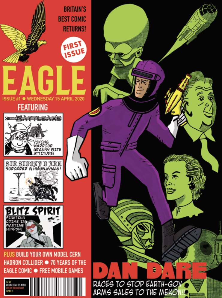
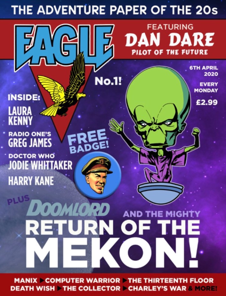
David Hill – Who doesn’t like a free badge? A lovely tribute to the traditional style of cover, with some cracking (if unexpected) guest appearances. I like the strapline – “the adventure paper of the 20s”. It lets you know exactly what you’re getting. Great font choices and the headline “return of the Mekon” sets you up for a story inside.
Atholl Buchan – all the colour! Really vibrant. The elements on this don’t blend as effectively as in Image 0, so it’s hard to read the scale of the different items. That said, it has a core focus on three things (hero, villain, science) so it picks up on the spirit of the comic.
Mal Earl – how much fun is this? Proper old school, sets up the hero and the villain for an epic story inside. Lovely layout. That said, is it a launch of a new Eagle or a re-boot of an old one? It’s very faithful to the old style so maybe lacks a bit of the original spark of others.
Philip Vaughn – better than a free badge – a free gift online! Nice way to get eyes on a website and reduce plastic waste! Tongue in cheek story ideas suggest that whilst it looks all modern, it’s actually playing to the traditional nostalgia audience – would a new reader get the joke?
Morgan Gleave – lovely new masthead and a great set-up of a story that you wouldn’t expect! The art style suggests something for younger readers but the story tease suggests slightly older themes, so be clear on who it’s for. Great colour and energy to it. Perhaps a bit too much going on?
Gary Hollingsbee – oh man, those green heads! That purple suit! Those other story ideas. This one’s right up there for wit and creativity, and gets a modernity pluspoint for offering mobile games. As a relaunch cover it gives you a great flavour of what’s inside and has a nod to the earlier art styles.
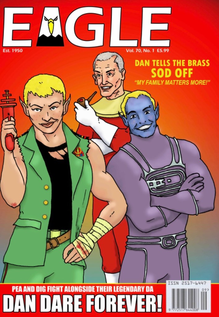
Stephen Sonneveld – how to introduce three characters in one hit, sets the tone really well, gives us a range of characters to be interested in and to root for. The choice of a “family photo” approach means it’s a bit static. Perhaps the theme could be used in a more dynamic way? – teases the stories well.
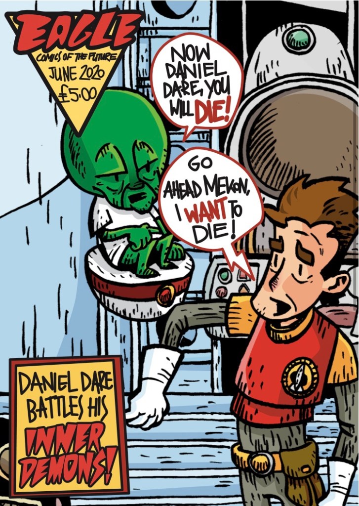
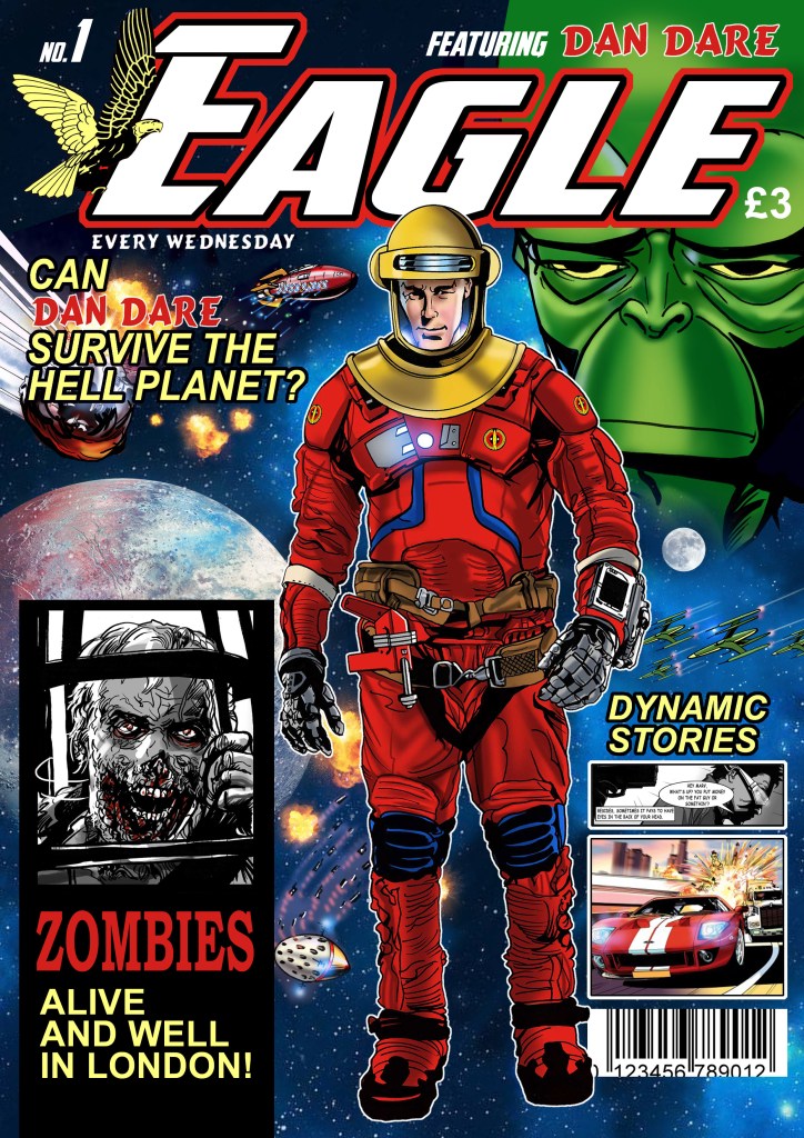
Martin Baines – Sets it up – the hell planet? Wow! There’s probably a bit more blending of the main elements and perhaps Dan could be in a more dynamic pose. The two sub-stories look fun but make the cover look quite cluttered; some of the other covers were able to integrate other text a bit more seamlessly. Nice colour palette!
My Top 3: Charlie Gillespie, Gary Hollinsbee and David Hill
PAT MILLS
I like the Charlie Gillespie design – the female mixed heritage Dan Dare. Here are my reasons
1) It’s beautifully executed and painted. Very professional. Excellent! Would love to know who the artist is.
2) It’s outrageous, not least because it features a sexy character that is rather non pc. And it not so subtly takes the piss out of the original Dan’s values which I’m not keen on. So, for me, it has a punk quality which will always press my buttons.
3) I know it will piss off traditional Dan Dare fans and that’s another reason I like it. I think Hampson’s original was perfect – a work of genius – and shouldn’t be tampered with – with versions that don’t come close to the original.
We should simply revere the original, not keep bringing him back, as I’ve written about in the past. I learnt my lesson, I hope.
I would hate and despise the idea of someone bringing back Slaine decades after I’ve popped my clogs. I don’t care how much homage is involved. F**k off would be my message from the grave.
I know there’s that thing about homage – but I’m very wary of homage. My personal experience of people copying me as homage has not been a happy one. It has a sly parasitical quality I don’t care for.
So if you’re gonna bring him back, it’s either got to be better than Hampson (impossible) or so wildly different it can’t be seen as a knock off , repeat or homage. Whoever this artist is, they’re bringing some NEW thinking and that’s to be commended. Excellent! Even if their talents would be better used on something unique and of their own.
BARRIE TOMLINSON
Very interesting and I really enjoyed looking at them and doing the judging. In my view there is only one winner and that is the one by Charlie Gillespie. The design of the cover is excellent. The modern logo is good, combining everything that is needed. The inclusion of the eagle head is particularly well done. The Mekon is very well drawn, with great detail. The idea of a female Dan Dare is a good one. I’m glad she retains the Dan Dare eyebrows. She is very well drawn. The whole cover looks full of class and makes you want to buy the issue. In my opinion, a worthy winner! I’d love to do a script for this artist!
I would go with two runners-up. The one featuring Dan’s Great, great, great great grandson and the one with the cover line: ‘Can Dan Dare survive the Hell Planet?’
STEVE MACMANUS
I choose David Hill on the basis that the front cover of a first issue has to work really hard to sell the new title and its content. In short, it’s all about cover lines not great artwork.
This cover does that really well, employing plenty of catchy, coverlines combined with a free gift and a good pic of the Mekon himself.
10/10.
So we have two winners (although they are all great and will appear in the Dan Dare Gallery)

Leave a comment